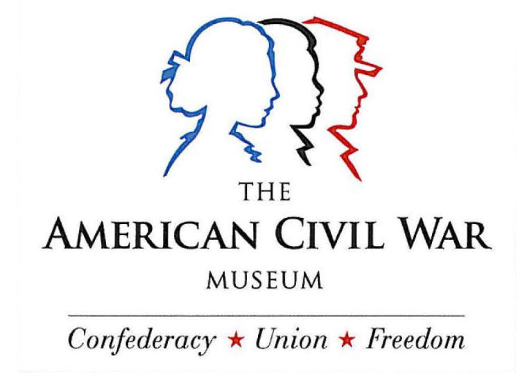
As many of you know, last year Richmond’s Museum of the Confederacy and American Civil War Center decided to join forces and form one museum. Today the American Civil War Museum moved one step closer to becoming a reality by unveiling its new logo. A brief history of the logo can be found here.
American Civil War Museum, Richmond, Virginia
I like it, too. It’s a reminder that people are the stuff of history. Plus, it just looks cool.
wow, I REALLY like it…
I like that! “Confederacy, Union, Freedom.” I always said “blue, gray and black” to illustrate the 3 basic factions but I like this better (and it avoids using ‘black’ as a racial moniker).
Every time I look at this logo I look for a reason to dislike it. I can’t find any. Instead, it brings forth the concept that the Civil War was about the people involved in it. It reflects a bottom up view of the conflict instead of a top down view. Judging from reactions I’m noting from NPS guides and local historians, many Americans are particularly interested in what people did during the war. How did people live? What did they wear? What were they doing? They want that personal story of how men and women lived and died in that time.
If that is what this museum plans to focus on, then I think it will do quite well. I like how the logo represents the soldiers, the slaves, and the women. Actually, when I say slaves, I should strike that and say Black Americans because their future was at stake whether they were free or enslaved. The CW was a crossroads on multiple levels for all Americans. I think this logo symbolizes the people of America as they sought which direction they would go.
The end result is that this is a very simplistic logo with a very powerful message contained in that symbology. I heartily approve of it. It symbolizes that the museum is not about the North or the South, but both sides…all sides of the struggle that took place. It is forward thinking. It is progressive.
I am very much looking forward to seeing what comes of this merger. Thankfully, both institutions are led by talented public historians who care deeply about the history.
Modern.. Could be used in a transparent style..
I like it and the reasoning behind it.
Inclusive.
Sincerely,
Neil
I like it. None of those three themes can really work without the other two.